Pick your genre: which look fits your face?
The genre sets your lighting, your colour and your pose, so it is the first choice you make and the one with the biggest effect. The six below all translate cleanly from a selfie to a poster, and each one puts your face under a different kind of light. Generate two or three before you decide, because faces respond differently to hard light than you expect.
Film noir leans on one hard key light and deep shadow, so it flatters strong bone structure and hides nothing. Action wants high contrast and an edge of warm light behind you. Sci-fi and cyberpunk push saturated blue and magenta with a rain-slick glow, which reads modern but can drift away from your real skin tone if you push it too far.
The rainy street is the crime-drama look: a dark coat with the collar up, wet reflections, blue-toned light, and it is the most forgiving if your input selfie was less than perfect because the shadow does half the work. Rooftop dusk trades shadow for open sky, a golden-to-blue gradient behind you and a quiet band of sky above your head for the title. The movie poster look is the balanced one: a dark jacket, teal-and-orange grade, haze behind you, the frame a one-sheet is built from.
Horror is the one genre that needs a different prompt set rather than a lighting change, because the tension comes from what is behind you and how little of your face you can see. If that is the poster you want, the Halloween AI photo prompts cover those setups properly, and they compose tall, which suits the 2:3 crop you are already planning for.
If you cannot choose, start with cinematic drama. It gives you balanced lighting and a serious lead-actor look that suits almost any title, and the frames tend to have the quiet band you need for type. The full set lives in the AI cinematic drama photo pack, and the same trained face carries over to any other pack you try later.
One phone selfie to 5 AI photos of the same person

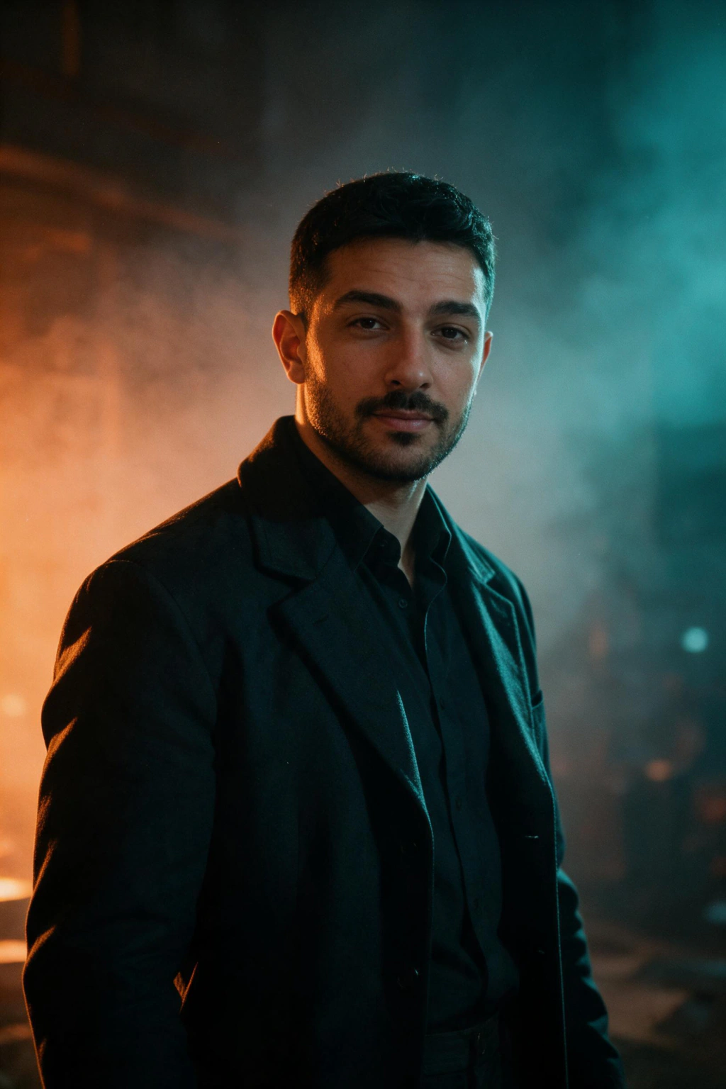
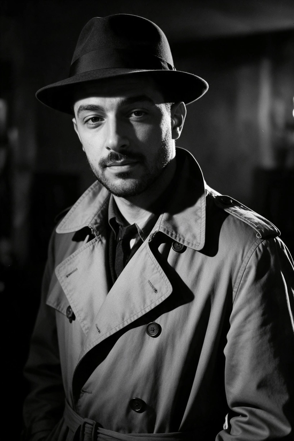
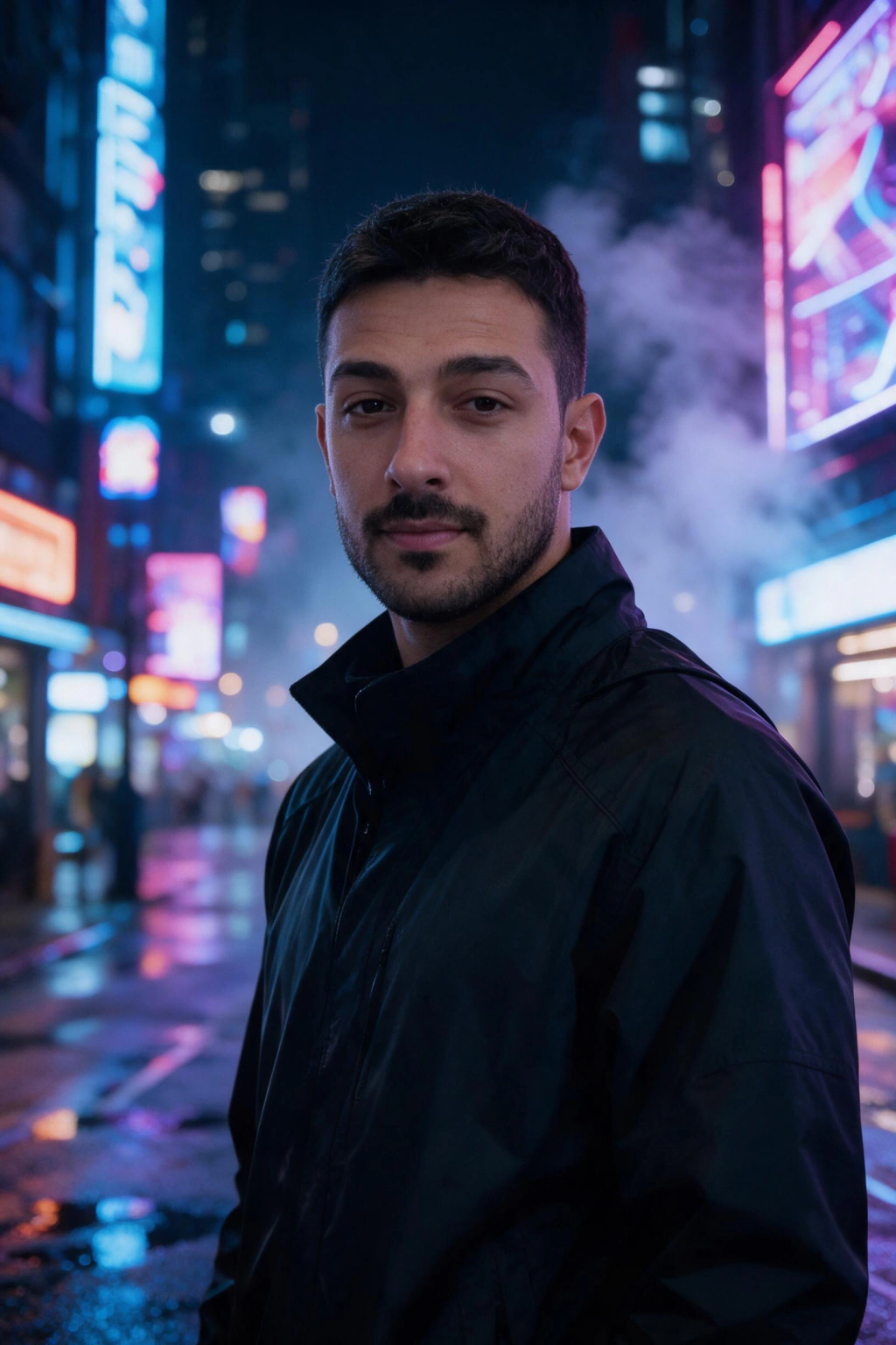
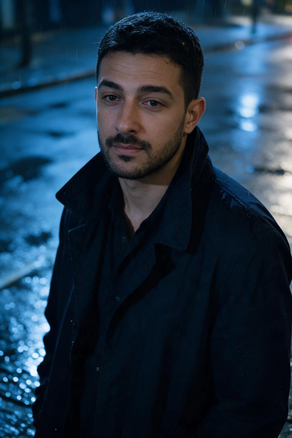
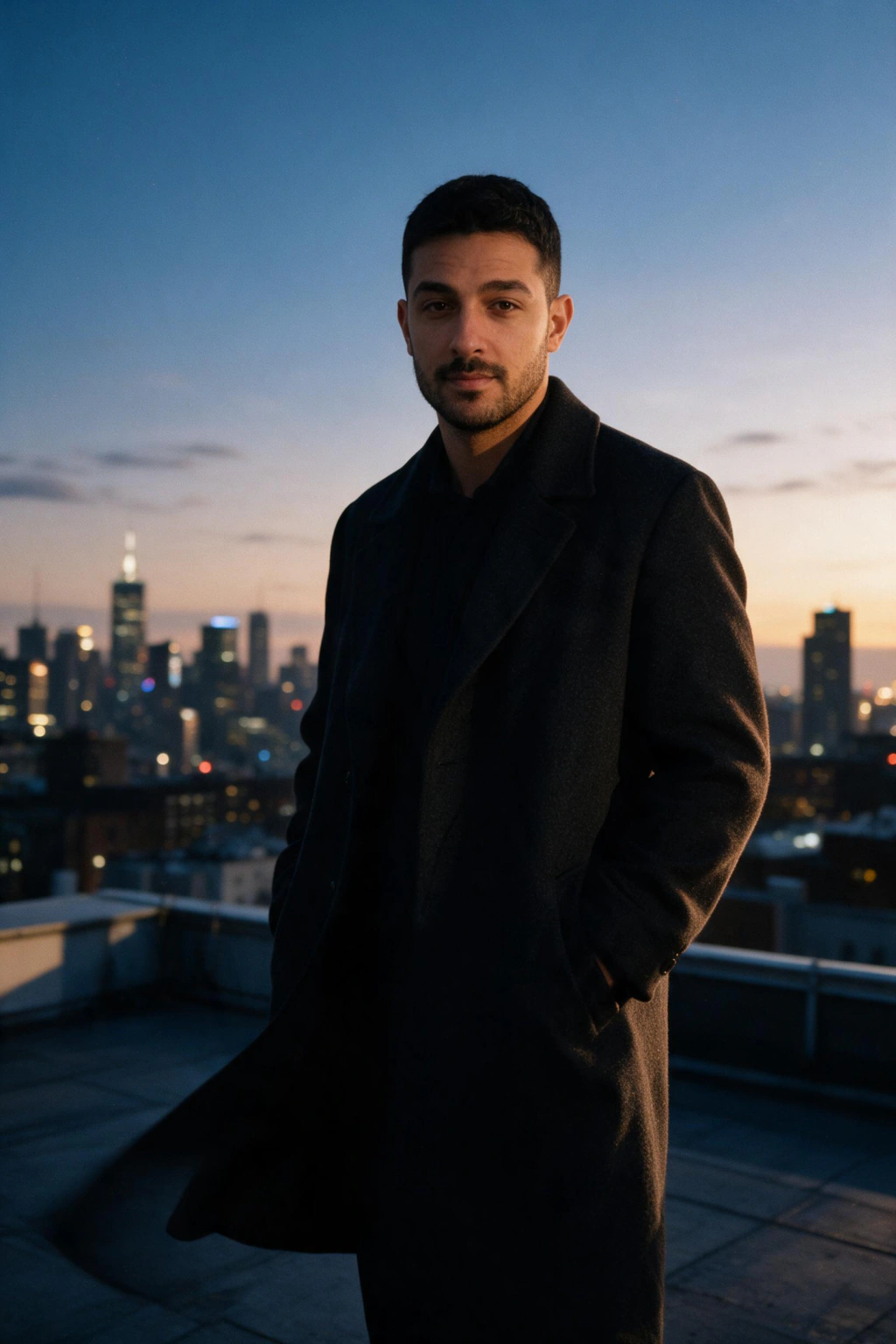
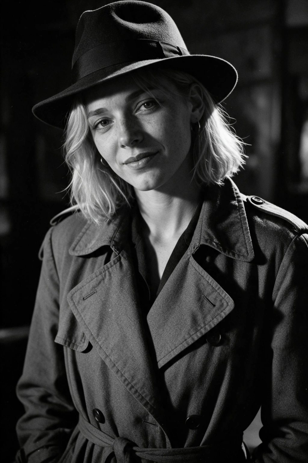
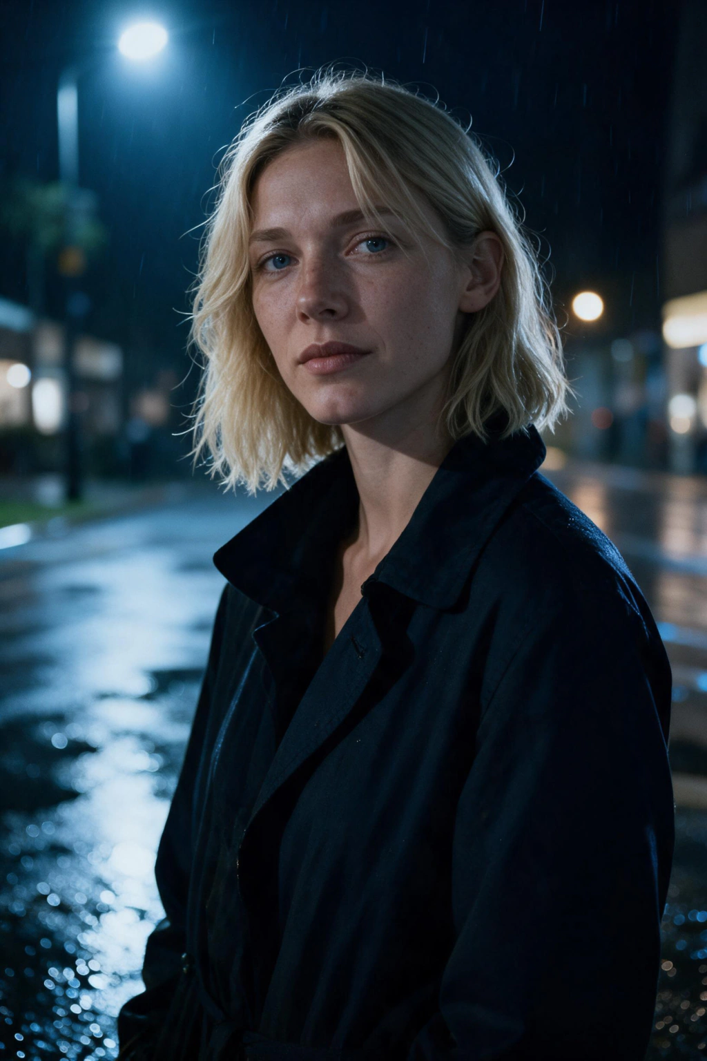
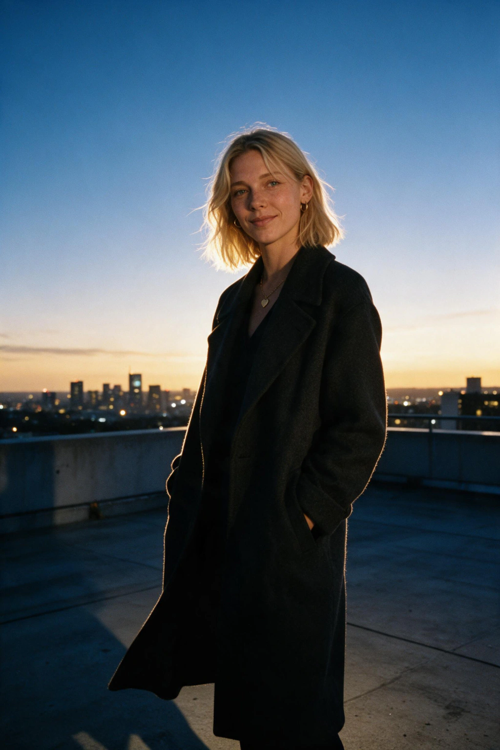
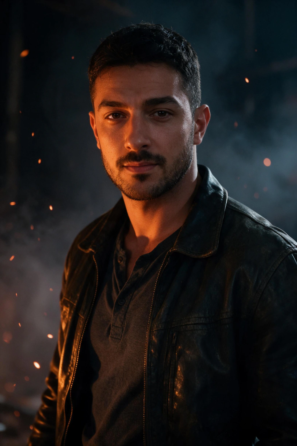
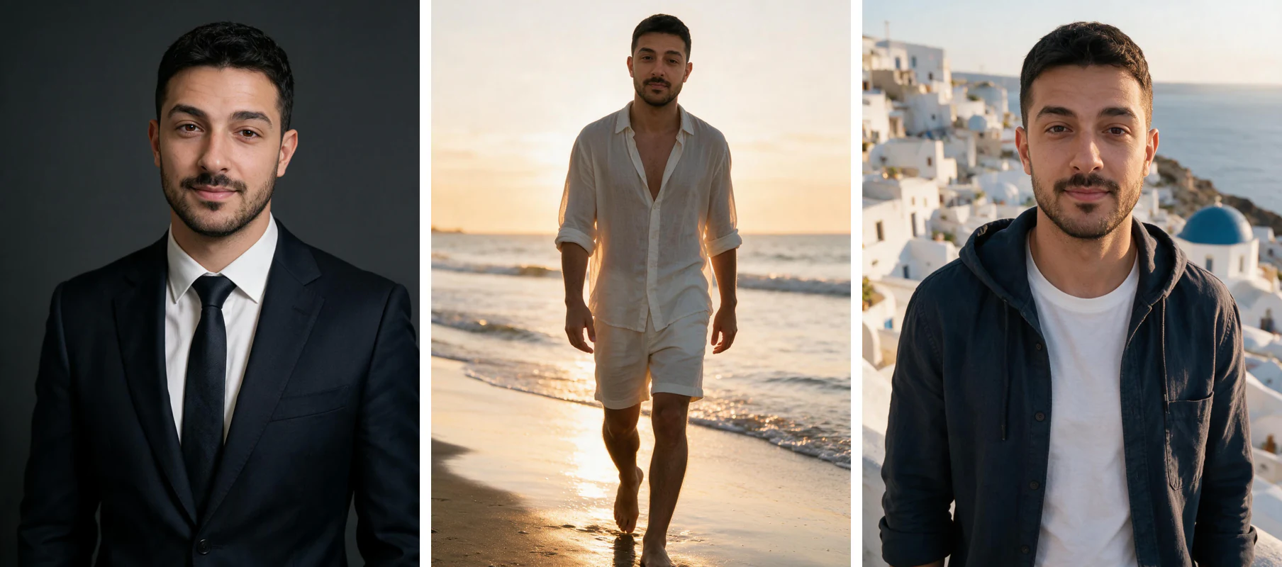
Pick a genre, upload one selfie, and see your face under that lighting.
How do you make a movie poster of yourself?
To make a movie poster of yourself, you upload one clear selfie, pick a genre look, and generate portraits at the 2:3 theatrical crop with about a third of the frame left empty for the title block. The generating part is the easy half. The frame you plan before you generate is what decides whether the result looks like a poster or like a portrait with words on it.
The face comes first. The model learns your features from a single uploaded selfie, then renders you under whatever lighting the genre calls for. You stay recognisable through all of it, which is the difference between a poster of you and a poster of a stranger who shares your haircut.
The clock is short. Each photo comes back in about 2 minutes at up to 4K with no watermark, and there is no model training to wait through. You can start it, make coffee, and come back to a set of cinematic frames waiting for a title.
The layout is the part people skip, and it is the part that shows. A theatrical poster is a portrait plus a type zone, designed together. Plan the type zone while you are choosing frames and the poster assembles itself in a few minutes. Skip it and you spend an hour trying to hide a title behind someone's shoulder.
Poster crops are 2:3, not the 4:5 your phone wants
This is the single detail that separates posters that work from posters that almost work. A theatrical one-sheet is 2:3, the ratio of a 27 by 40 inch poster. Social apps use 4:5, which is noticeably shorter, and most AI photo tools frame for social because that is where photos usually end up. Generate at 4:5 and your title block has nowhere to sit.
Rule 1, decide the ratio before you generate, not after. If you plan the poster at 2:3 from the start, you compose your face higher in the frame and leave the lower band quiet. If you decide afterwards, your only options are stretching the image, adding fake letterbox bars, or dropping the type over your chin. All three read as amateur.
Rule 2, protect the bottom third. On a real one-sheet, the bottom third holds the title, the tagline and the billing block, that dense little strip of credits in condensed type. If your frame is busy down there, the type competes with the picture and you lose both. Fog, shadow, a wall, a dark floor or open sky all work as the quiet band.
Rule 3, do not rescue a short frame by cropping the sides. Narrowing a 4:5 image into 2:3 cuts your shoulders off and pushes your head into the middle, which is where posters never put a face. You end up with a cramped portrait rather than a taller one. Generating fresh costs you 10 credits and about 2 minutes.
Rule 4, check the poster at thumbnail size before you commit. Real posters are designed to survive being seen two inches tall on a wall of listings. Shrink yours until it is the size of a stamp. If your title disappears or your face turns into a smudge, the contrast is wrong, not the idea.
The practical version of all four rules is one sentence. Pick the frame with the empty third, place it in a 2:3 canvas, and let the quiet part carry the type. Everything else on a poster is decoration you can add or remove without breaking it.
What your input selfie has to give the model
A poster of yourself starts with clean information about your face, because cinematic lighting exaggerates whatever it is given. Shoot one selfie in soft window light at roughly 45 degrees, on the rear camera rather than the front one, with beauty mode and skin smoothing switched off. Keep sunglasses off, keep a hat brim off your eyes, and push your hair back.
Neutral expression beats a big smile here. Posters almost never use a wide grin, so a relaxed face gives the model the jawline, the eye shape and the shadow structure it needs to build a lead-actor look. A hard flash selfie taken at arm's length in a dark room gives it almost nothing to work with.
One selfie is the whole upload requirement. You are not assembling a set of ten or fifteen photos, and adding more of your camera roll does not make the poster better. Getting that one photo right takes about five minutes and improves every genre you generate afterwards, which is a far better trade than regenerating twice.
How to lay out the poster once you have the frame
Step 1, open a 2:3 canvas. Any editor or slide tool does this. Set the page to a 2 by 3 proportion, drop your chosen portrait in, and scale it so your eyes sit roughly a third of the way down from the top. That is where posters put a lead face, and it leaves the lower band clear.
Step 2, place the title in the quiet third. Big, condensed, and either at the very bottom or just under your chin depending on the frame. One typeface is enough. If the title fights the picture, the problem is usually the frame you picked rather than the type you set.
Step 3, add the tagline above the title. Keep it under seven words, set it small, and space the letters out. Taglines work because they are quiet next to a loud title, so resist the urge to make yours big enough to read across a room.
Step 4, add a billing block if you want the last five percent. That is the thin strip of condensed credits at the very bottom of a real one-sheet. It is the detail your eye recognises before you consciously read anything, and it turns a nice portrait into something that looks like it came from a studio.
Step 5, hold yourself to three or four colours total. Real posters are colour-disciplined because they have to work on a bus stop and on a phone screen at the same time. Pull your title colour out of the image itself, use white or near-black for everything else, and stop there.
What makes a poster portrait look real instead of rendered
Realism in a cinematic frame comes from the same details a lighting crew argues about on set. You are checking four things, and you can check all of them in about ten seconds per frame before you commit one to a layout.
Run every candidate frame past the four below. Frames that fail two of them will look fine on your phone and fall apart the moment the poster is printed or viewed full width, which is exactly when you want it to hold.
Light with one clear source
Shadows fall the same way on your face, your neck and your collar, and you can point at where the light is coming from.
Motivated light is what makes an image feel photographed. Shadows that disagree are the fastest tell that nothing was lit at all.
Skin that keeps its texture
Pores, a little shine on the forehead, stubble or fine hairs at the edge of the jaw, and no plastic smoothing across the cheeks.
Dramatic lighting normally reveals texture. A hard key light on flawless skin is a combination that never happens on a real set.
Real depth behind you
The background falls off softly rather than sitting flat behind your head, and there is space between you and whatever is back there.
Separation is what reads as cinematic. A flat backdrop makes a portrait look like a passport photo with mood lighting.
A quiet third for the type
One band of the frame is calm: sky, wall, fog or shadow, with nothing competing for attention inside it.
Without it there is no poster, only a portrait. This is the single thing that decides whether the layout stage takes minutes or hours.
Why generate a poster instead of booking a cinematic shoot?
A real cinematic session needs a photographer, a lighting rig, a location and a booking, and you get one look out of the day you paid for. Generating from a selfie gives you the lit-on-set look without any of that scheduling, and it gives you several genres from the same upload rather than one.
Range is the real advantage. One upload can return a noir frame, an action frame and an old Hollywood frame in the same session, so you can test which genre your face actually suits before you commit to a title and a layout. Faces surprise you here. The genre you assumed was yours often is not.
On cost, the honest version: photos are paid for with a one-time credit pack rather than a subscription, so you pay once for what you generate and the credits do not expire on you. Current pack sizes sit on the pricing page, and every purchase carries a 14-day money-back guarantee.
Mistakes that ruin a poster of yourself
Nearly every failed poster fails for one of these five reasons, and four of them happen before you generate anything. Read them once and you will save yourself a round of regenerating.
Mistake 1, generating at 4:5 because that is what your phone shows. You get a portrait built for a feed, then you spend the layout stage trying to invent room for a title that was never planned for. Set the poster ratio in your head at 2:3 before you pick a single frame.
Mistake 2, choosing the most beautiful frame instead of the most usable one. The frame with the incredible detail edge to edge is exactly the frame that leaves your type nowhere to go. A slightly plainer image with a calm band across the bottom makes a far better poster every time.
Mistake 3, putting the title over your face because there was no other space. It happens late, when you are tired of the project and want it finished. The result covers the one thing the poster exists to show. Go back and pick a different frame instead, it costs you five minutes.
Mistake 4, using five typefaces and four colours. Real posters are restrained because they need to work small. One condensed typeface for the title, one small face for the tagline, three or four colours total, and the whole thing reads at a glance rather than after study.
Mistake 5, feeding it a filtered selfie. Beauty mode strips the texture the model needs, and cinematic lighting then has nothing real to carve into. You end up with a smooth mask under dramatic light, which is the exact look people mean when they say a picture looks generated. Shoot a fresh one at a window.
Frequently Asked Questions
- What is an AI movie poster generator?
- An AI movie poster generator turns a single selfie into a cinematic poster styled like a real film one-sheet. You upload one photo, pick a genre such as film noir, action or crime drama, and get portraits back at the 2:3 theatrical crop in about 2 minutes, ready for a title.
- How do I make a movie poster of myself?
- Upload one clear selfie, pick a cinematic genre such as noir, action, cyberpunk or old Hollywood, and generate portraits of your own face under that lighting. Then place your favourite frame in a 2:3 canvas and put the title in the quiet third you planned for. Photos come back at up to 4K with no watermark.
- What aspect ratio should a movie poster be?
- 2:3, the ratio of a standard 27 by 40 inch theatrical one-sheet. Social apps use 4:5, which is shorter, so a frame generated for Instagram leaves your title block nowhere to sit and the type ends up over your face. Decide on 2:3 before you generate rather than cropping afterwards.
- Can I really put my own face on a movie poster?
- Yes. The model learns your features from the selfie you upload, then renders cinematic portraits built around your face rather than a generic character who vaguely resembles you. You stay recognisable, just lit and styled like the lead in a film.
- How many photos do I need to upload?
- One. A single clear selfie with a neutral expression, shot in soft window light at about 45 degrees on the rear camera with beauty mode off. That one photo sets the ceiling for every genre you generate, so it is worth five minutes of care.
- How long does it take to generate a cinematic portrait?
- Each photo comes back in about 2 minutes, with no model training to wait through. You can review the whole set, pick the two or three frames with a usable quiet third, and download them in one sitting.
- Which poster genre should I start with?
- Start with cinematic drama if you are unsure. It gives you balanced lighting and a lead-actor look that suits almost any title, and its frames usually include the calm band you need for type. Noir suits strong bone structure, old Hollywood is the most forgiving, and cyberpunk is the easiest to overdo.
- Why does my poster look fake once I add the title?
- Almost always because the type is sitting on detail. When a title lands over a busy background or across your jaw, both the picture and the words lose. Pick a frame with an empty third, set the title inside it, and hold the whole poster to three or four colours.
- Is MakeAiPhotos a subscription?
- No. You buy a one-time credit pack and spend it on the photos you generate, and the credits do not expire. Current pack sizes are listed on the pricing page, and every purchase is backed by a 14-day money-back guarantee.